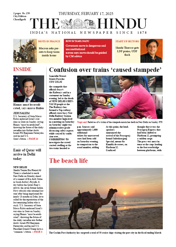
2. Newspaper Layout — THE HINDU (News Broadsheet)
• Design Highlights:
• Classic Grid Layout: Adheres to traditional newspaper structure with columns, headlines, and sidebars for news organization.
• Visual Balance: Balanced text and imagery placement; major story at center, with supporting stories and images around.
• Typography: Serif fonts for readability and authority, typical of traditional news publications.
• Use of Color: Strategic use of red and orange in headers to distinguish sections like "INSIDE", "RIOTS IN FRANCE", etc.
• UX Perspective:
Easy navigation through segmented sections.
Strong hierarchy helps readers scan quickly.
Visual clarity through contrasting headline sizes and imagery.
Purpose Fulfilled: Communicates news in a credible, structured, and visually digestible format.
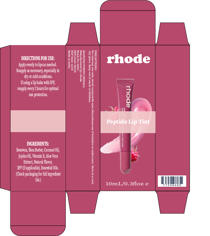
3. Product Packaging — Rhode Peptide Lip Tint
• Design Highlights:
• Compact Box Layout: The dieline is well-structured for folding and physical packaging.
• Color & Branding: Monochromatic dusty rose/pink tone reflects a soft, clean, and luxurious beauty brand aesthetic.
• Typography: Bold, sans-serif "rhode" logo reinforces brand identity. Serif fonts used for instructions and ingredients for legibility.
• Information Hierarchy:
Front panel focuses on branding and product visual.
Side panels provide clear instructions, ingredients, and warnings.
• UX Perspective:
Easy to read and visually appealing on retail shelves.
Clear function, application, and content visibility.
Barcode and sizing included for retail compatibility.
Purpose Fulfilled: Communicates product identity, usage, and branding effectively while being shelf-ready.
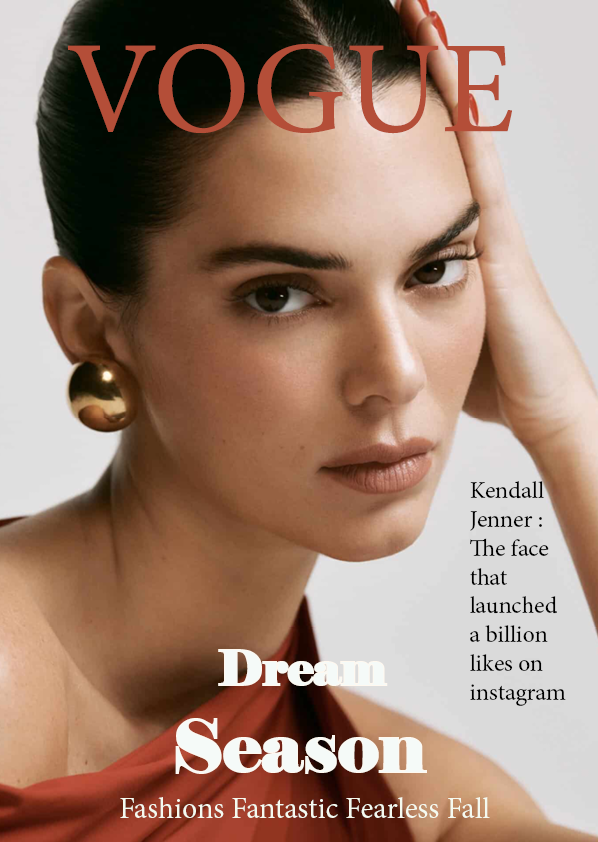
1. Magazine Cover Design — VOGUE (Fashion Magazine)
Design Highlights:
• Visual Hierarchy: The title "VOGUE" is placed prominently at the top in a large, serif font that instantly grabs attention.
• Model as Focal Point: The face of the model (Kendall Jenner) occupies the center, using direct eye contact to engage viewers.
• Typography: Elegant serif fonts are used in different weights — heavier for emphasis ("Dream Season") and lighter for supplementary text.
• Color Palette: A sophisticated palette of warm neutrals and earthy tones complements the skin tone and attire, creating a high-fashion aesthetic.
• UX Perspective:
Instantly recognizable branding and model.
Clean layout with minimal text prevents visual clutter.
Use of whitespace helps focus attention.
Purpose Fulfilled: Effectively communicates luxury, fashion, and editorial credibility.