Objective
The objective of this project was to rebrand and modernize Sun Umbrellas India, a century-old brand, by addressing both functional shortcomings and outdated brand identity. The goal was to design an umbrella that not only withstands urban weather challenges but also offers aesthetic appeal, emotional connection, and user-centered innovation. Through this project, I aimed to create a cohesive design system — from a minimal logo and aerodynamic umbrella form to interactive tags, playful charms, and durable silicone covers — that reflects reliability, modernity, and everyday convenience while reinforcing the brand’s legacy in a contemporary market.
1. Empathize
The process began with understanding the everyday struggles of umbrella users in urban India. I conducted user research focusing on the monsoon season and sunny weather conditions, which revealed recurring frustrations:
Umbrellas being fragile and breaking easily in strong winds.
Conventional designs not preventing sideways water splashes.
Synthetic covers that tore quickly and lacked durability.
Outdated branding that failed to appeal to younger, style-conscious consumers.
Lack of distinct identifiers, leading to umbrellas being confused, swapped, or lost.
I also benchmarked global and Indian umbrella brands, identifying gaps in durability, branding, and user-centered innovation. These insights highlighted that consumers craved not just a rain shield, but an umbrella that was functional, stylish, and emotionally engaging.
2. Define
Based on the insights, I framed a clear problem statement:
Urban consumers lack umbrellas that balance functionality, aesthetics, and emotional connection.
The challenges were broken down into:
Outdated imagery: The existing logo and identity felt irrelevant in today’s minimal, design-conscious market.
Packaging with no recall value: Tags and sleeves were functional but uninspiring.
Generic product design: The umbrella looked like any other, offering no clear differentiator.
Low engagement touchpoints: The brand did not connect with users beyond the physical product.
This stage helped me define precise opportunities for design intervention — from logo to product form, packaging, and accessories.
3. Ideate
With a clear direction, I brainstormed solutions across visual identity, product form, and user interaction:
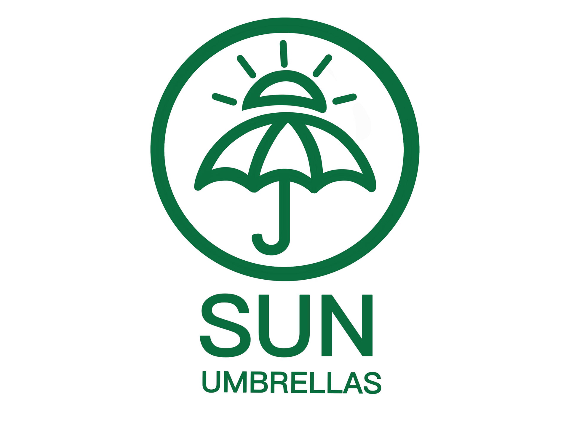
• Logo & Branding: Moved away from a playful sun character and created a neutral-toned, minimal logo that resonated with trust, protection, and longevity.


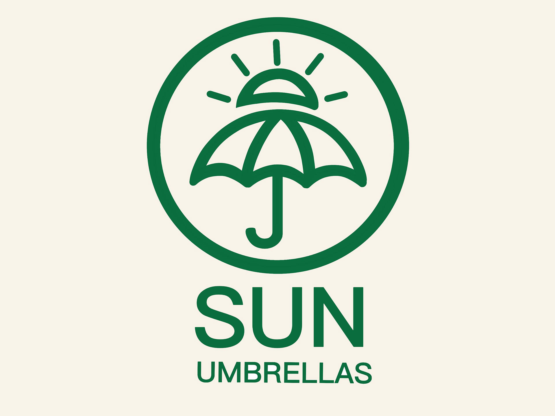
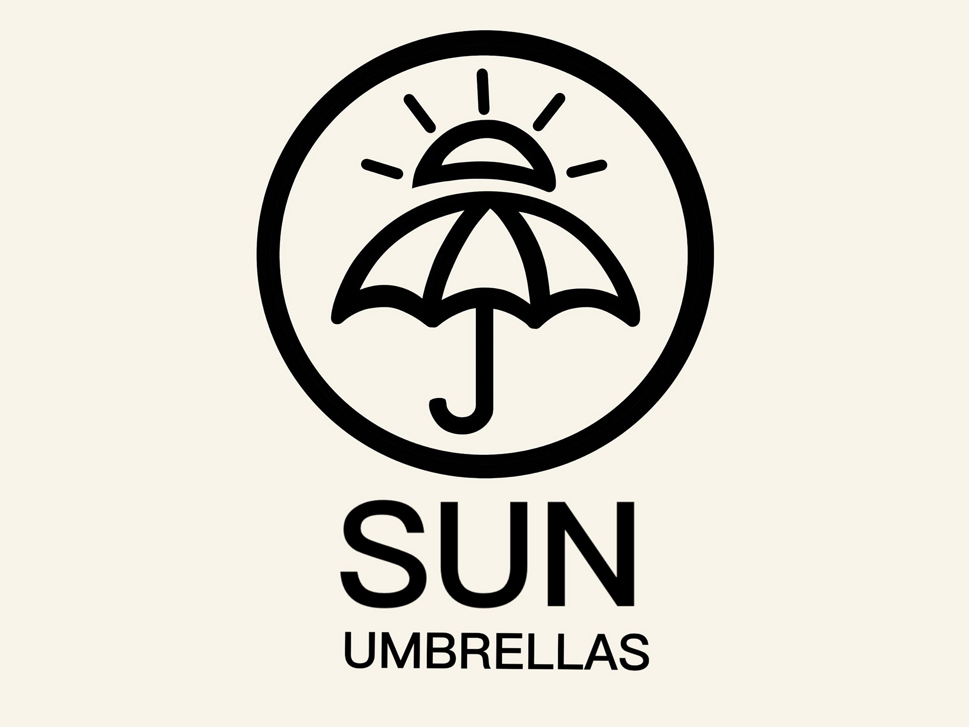
(1) Logo Design Iterations

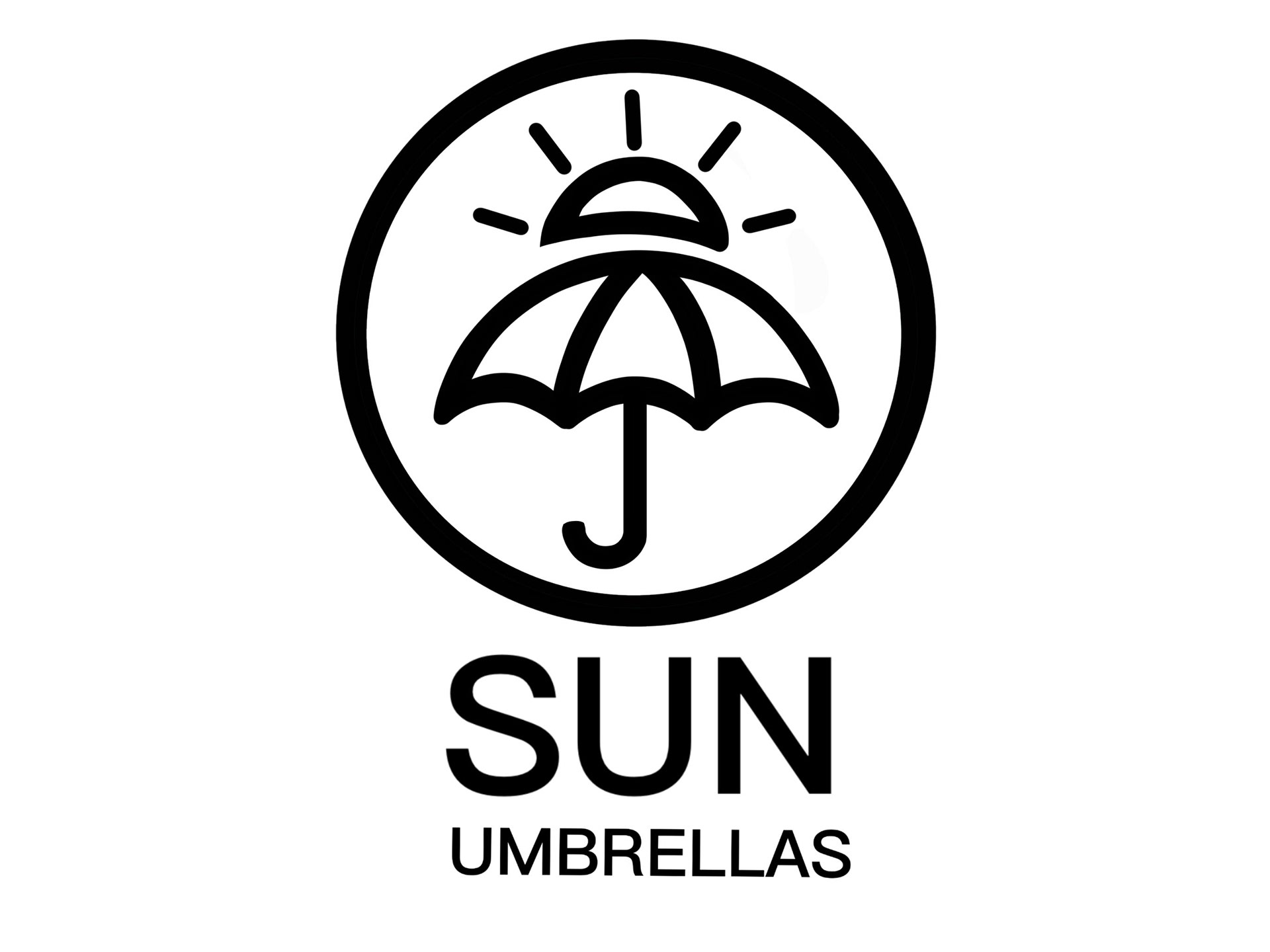
(1.1) Existing Logo
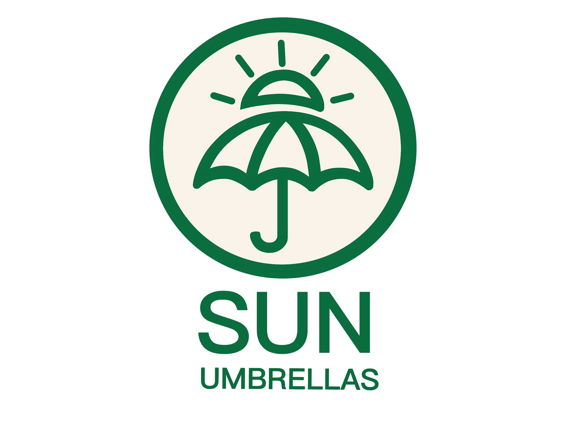
(1.2) Re-designed Logo
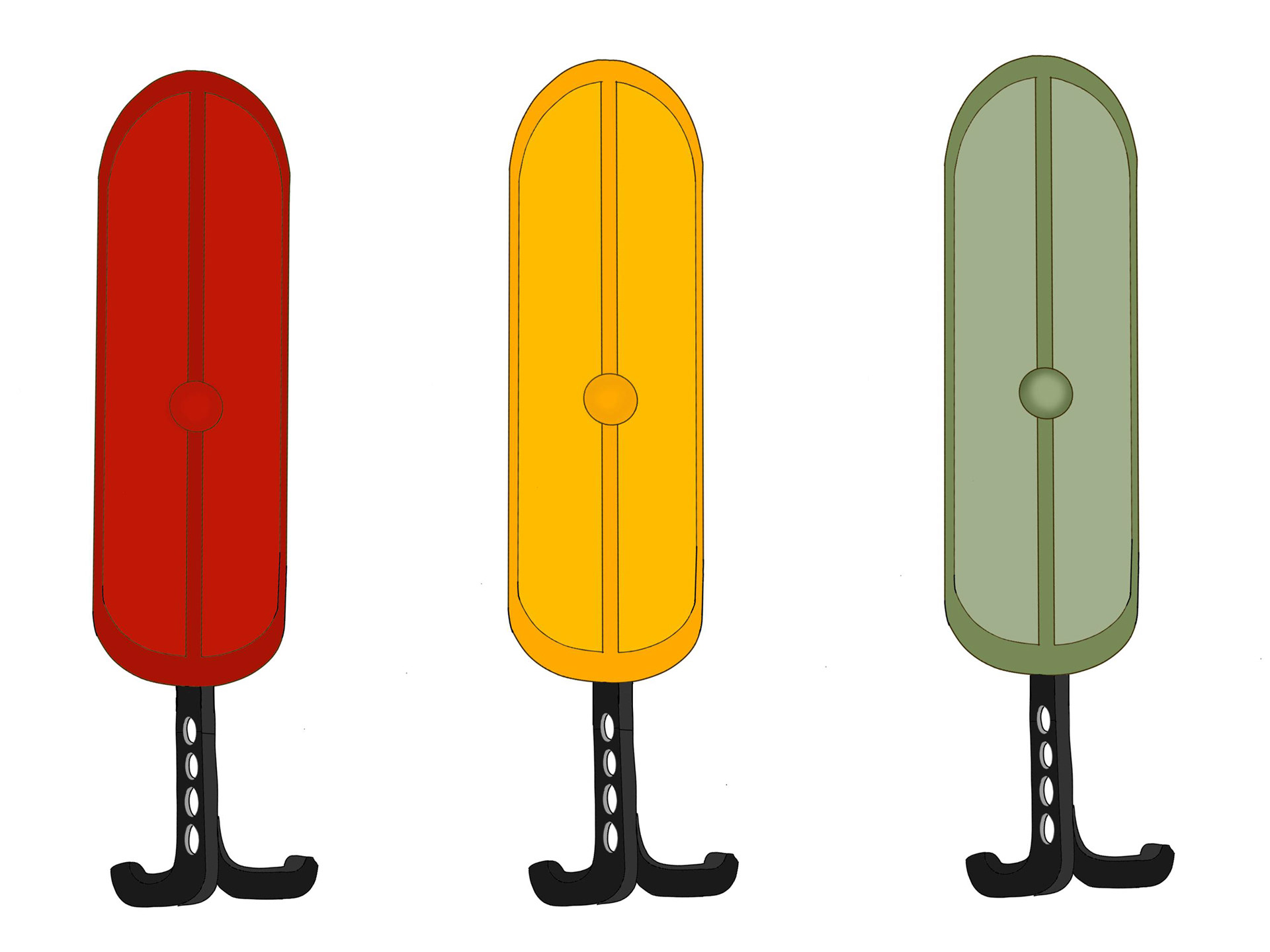
• Hero Product (Umbrella Redesign): Introduced an aerodynamic form, elongating one side so the umbrella:
Resists wind lift.
Channels rainwater away to prevent splashing.
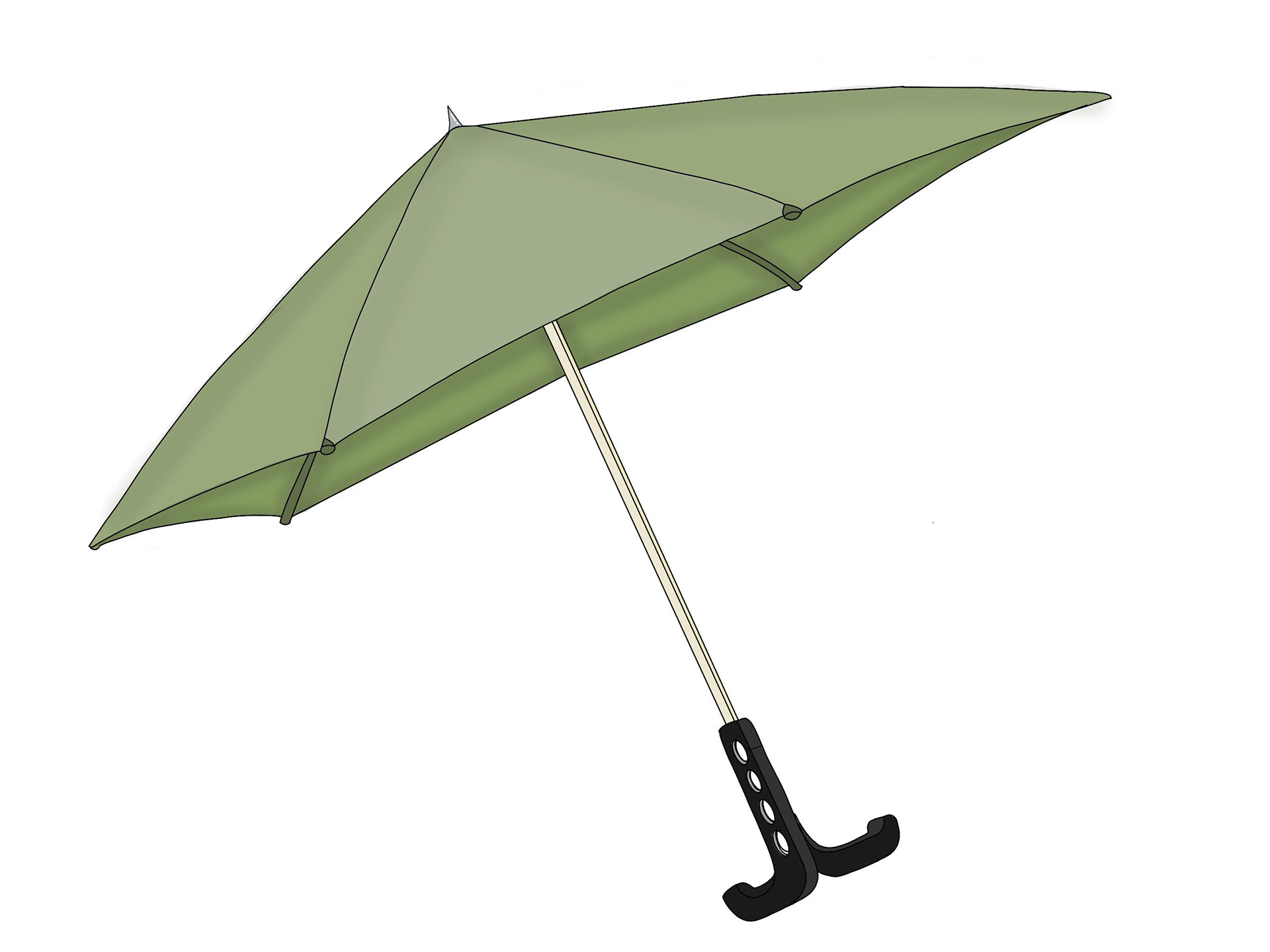
(2.1) Hero Product (Front View)
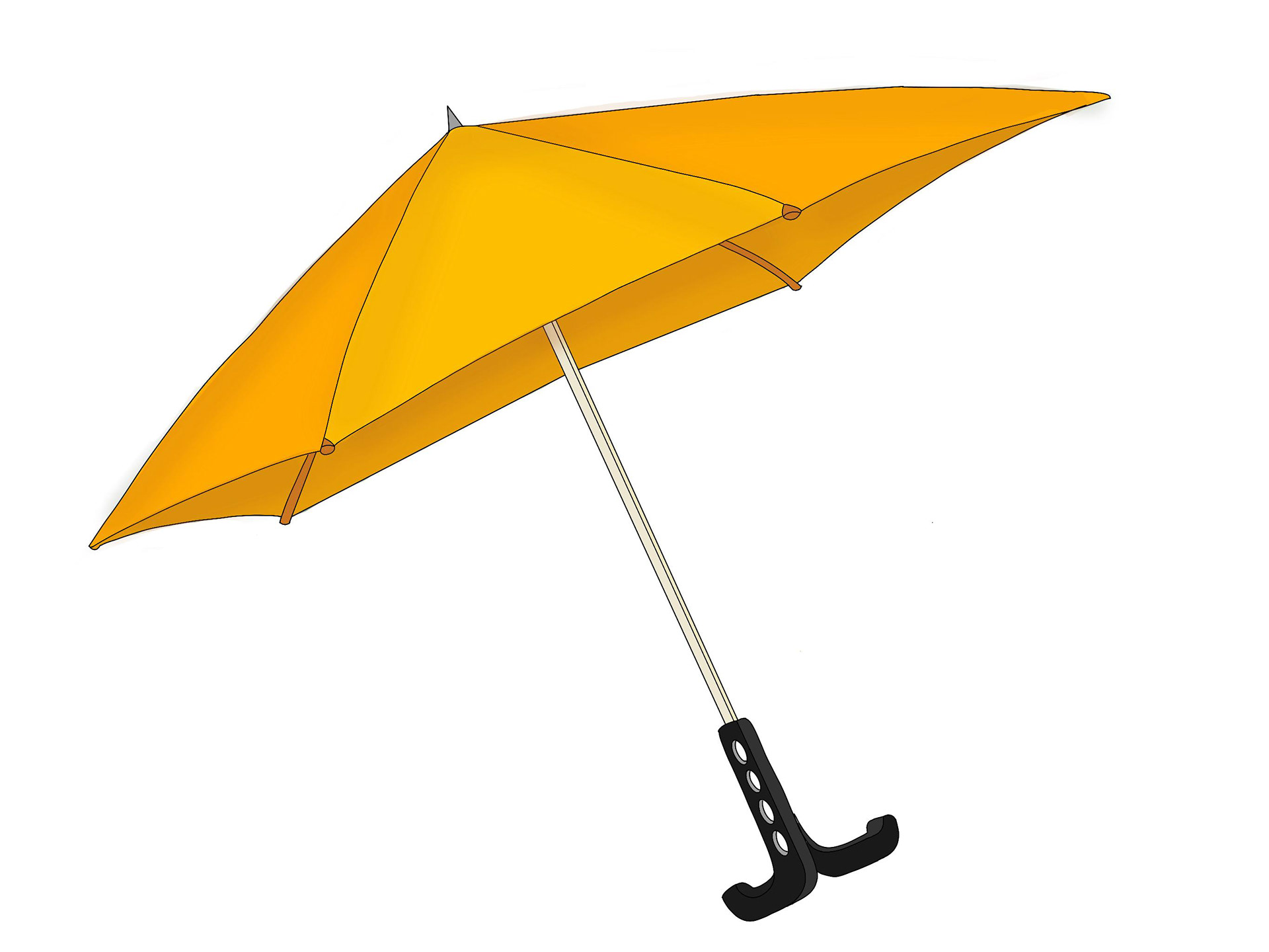
(2.2) Hero Product (Front View)

(2.1) Hero Product (Top View)
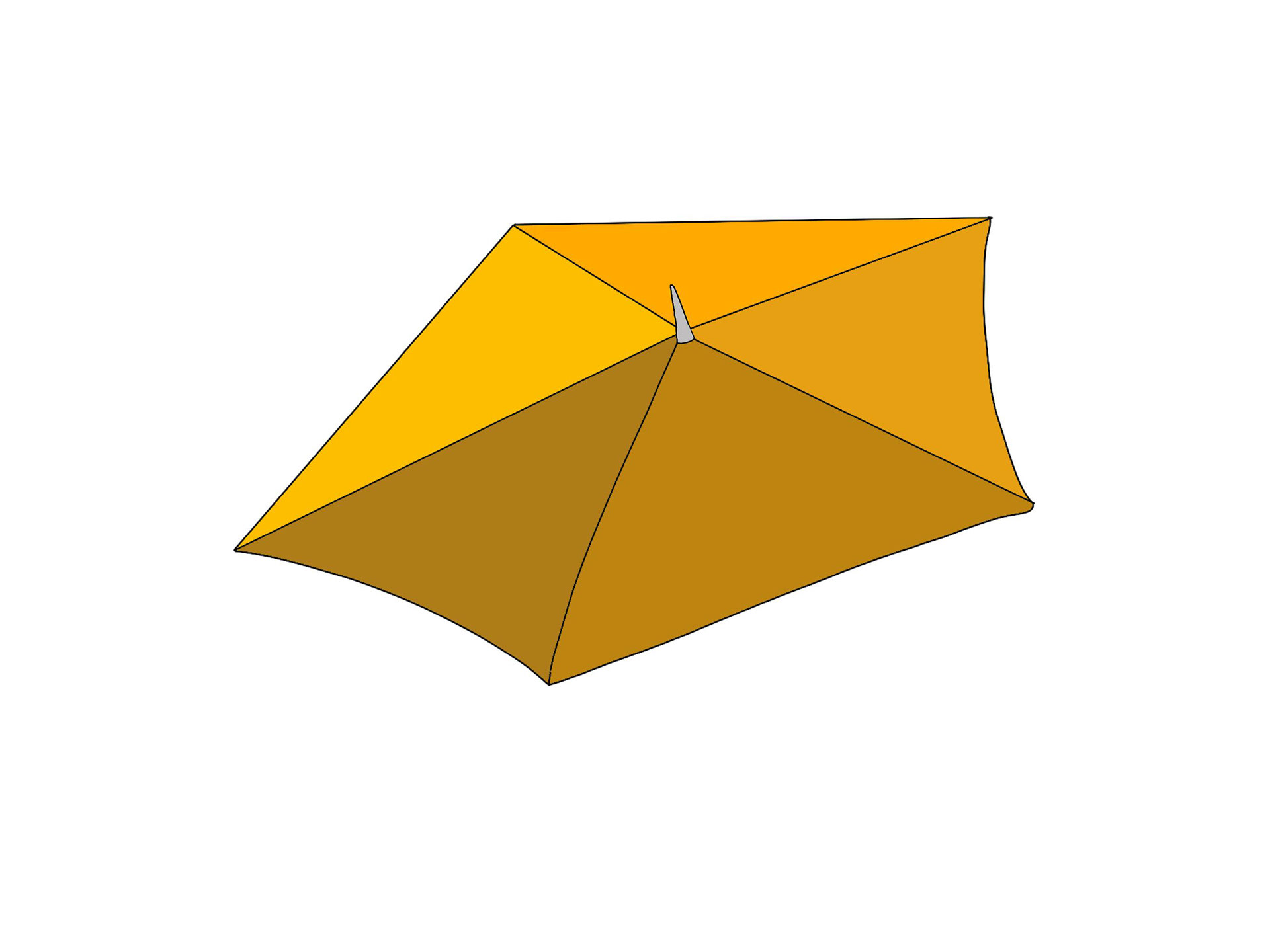
(2.1) Hero Product (Top View)
• Tags: Redesigned them to be interactive and functional, integrating QR codes for weather updates or brand engagement

(3.1) Tags
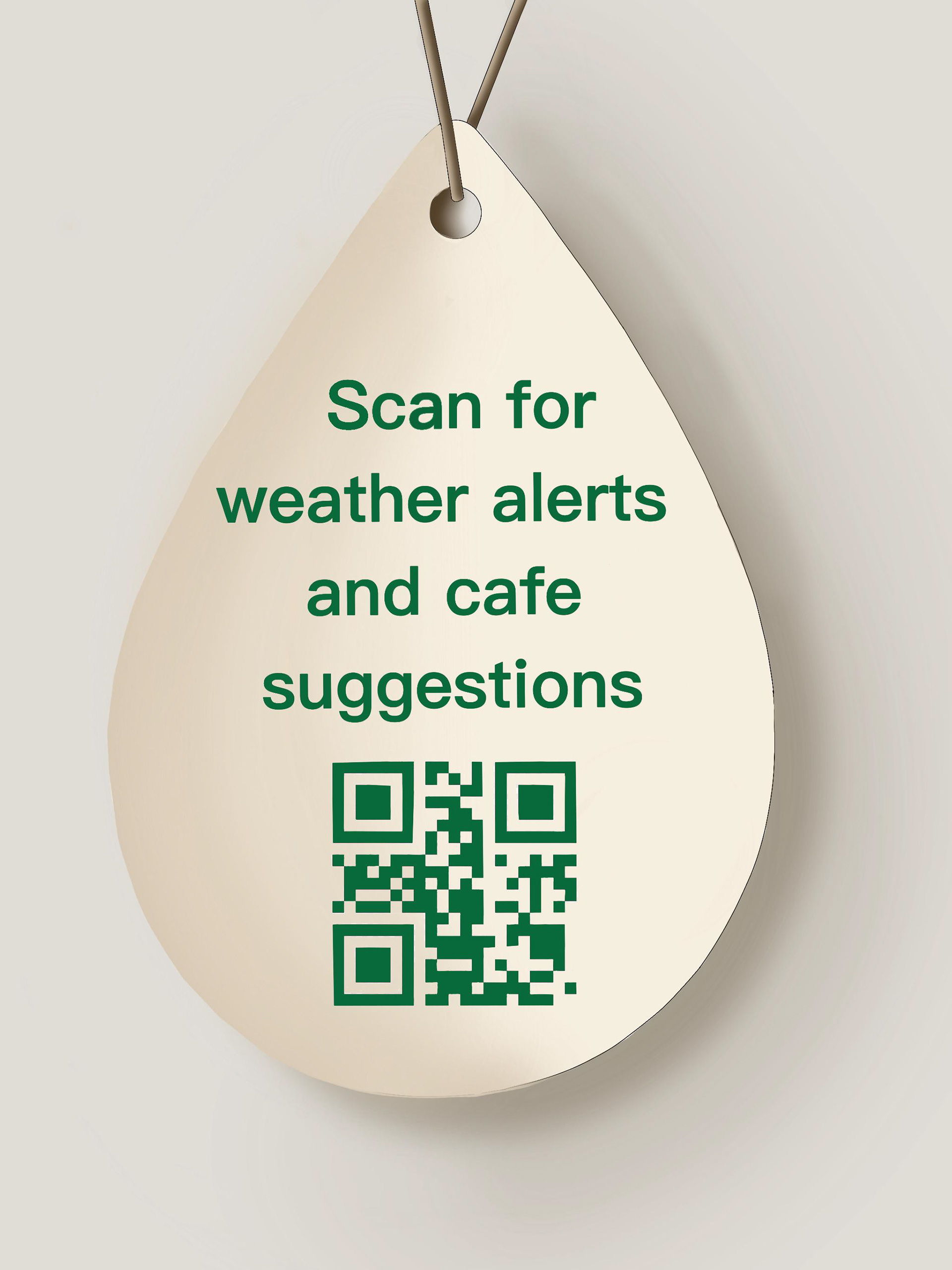
(3.2) Tags
• Rubber Charms: Inspired by Crocs, I created small customizable charms that attach to umbrellas, solving the “mix-up and loss” problem while adding personality.
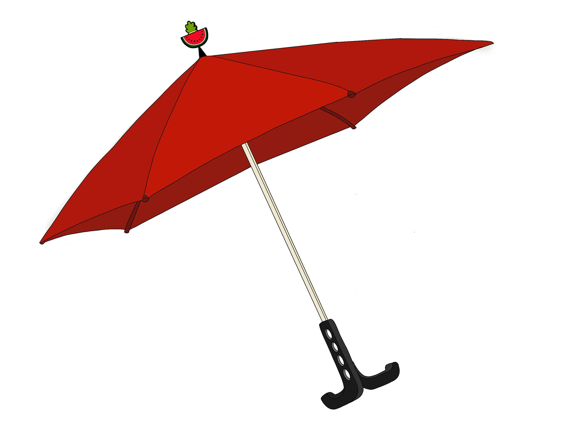
(4.1) Watermelon Charm
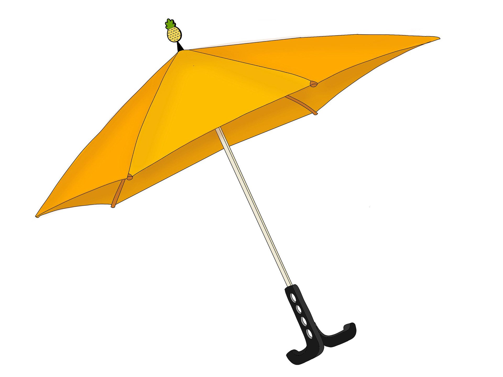
(4.2) Pineapple Charm

(4.3) Initial charm
• Covers: Replaced synthetic sleeves with durable silicone covers that are waterproof, flexible, and longer lasting.
(5) Umbrella Covers
• Double Handle Innovation: Designed an umbrella handle with dual usability – one for holding, the other for hanging bags or belongings for convenience in urban commuting.
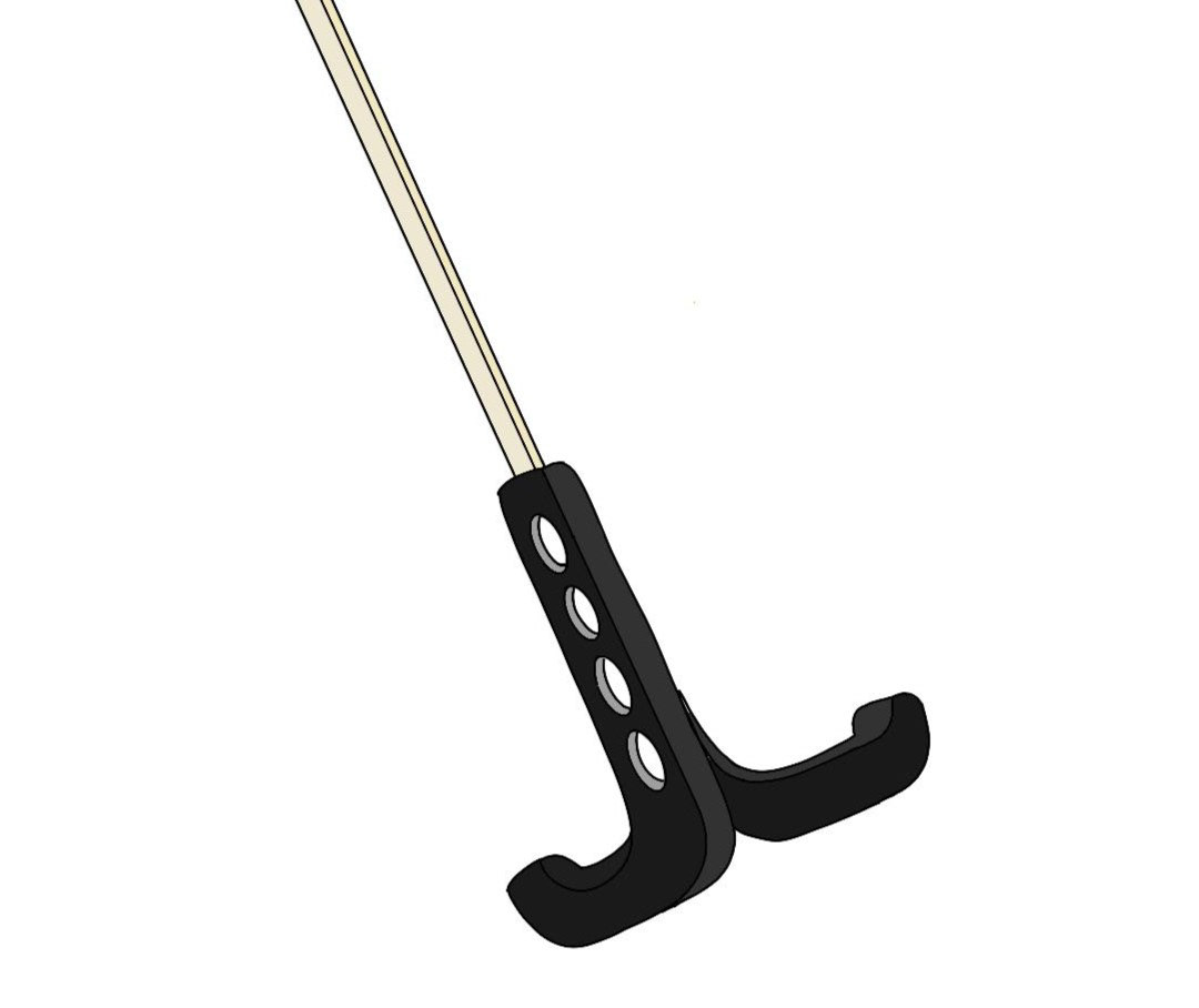
(6) Double Handle
This stage was about merging practicality with brand storytelling, ensuring each redesign choice tied back to real user needs.
4. Prototype
I translated the ideas into tangible prototypes across multiple touchpoints:
Logo: A refined, minimal mark in neutral colors that visually communicates “shade & protection.”
Hero Umbrella (AeroShade): Sleek, aerodynamic, compact, and lightweight for daily urban use.
Tags: QR-enabled prototypes that tested user engagement and recall.
Charms: Playful rubber prototypes that allowed personalization and solved ownership issues.
Covers: Silicone models that replaced flimsy sleeves, proving more durable and sustainable.
Handles: Double-handle model tested for ergonomics and weight distribution.
Each prototype aimed to blend functionality with an upgraded aesthetic, modernizing the brand’s product experience.
5. Test & Refine
The redesigned prototypes were tested with users and peers to collect feedback on usability and appeal. Key findings:
The aerodynamic umbrella successfully reduced wind resistance and redirected rainwater.
Users appreciated the neutral logo for its timelessness and professional identity.
Tags and charms were perceived as fun, memorable, and practical.
The silicone cover stood out as a durable, premium improvement over traditional sleeves.
The double-handle received positive feedback for multi-tasking convenience, especially for commuters.
Based on feedback, I refined visual details, adjusted ergonomics, and polished packaging elements to align with a modern yet trustworthy image.
Final Outcome
The rebranding of Sun Umbrellas India resulted in a cohesive design system that seamlessly integrates:
A minimal, timeless logo.
An aerodynamic umbrella tailored for urban conditions.
Interactive tags and playful charms to enhance brand recall.
A durable silicone cover as a functional upgrade.
A dual-handle innovation that extends usability beyond just holding.
This project demonstrates how human-centered design and thoughtful innovation can transform a century-old brand into a contemporary, functional, and emotionally resonant experience.